I have been meaning to make this post for ages now (pretty much ever since Ragnell put out her first call for subs for the feminist carnival), but unfortunately it has come at a time where I’m freaking out over my last minute arrangements. This will, in fact, be my last real post for a while (more details to follow in my actual last post for a while).
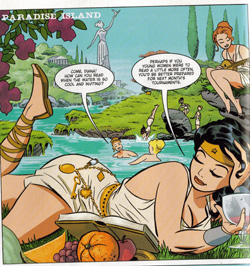
When Ragnell put up what she thought was a fairly neutral image of Diana (that’s Wonder Woman, the Amazon warrior for justice and peace and stuff, for those of you not in the know) reading. I looked at it and “perfect example of the male gaze” is what stared right back at me. Me – thinking nothing of making such a comment on a blog by a woman who waxes poetically about the colour yellow and what it means when used in a Green Lantern comic – well, let’s just say I was surprised that pretty much none of her regulars agreed with me. At all. Even Ragnell herself wasn’t fully on board with my interpretation.
And that got me thinking: Have we become so desensitized to female sexuality that it reads as “neutral” to us when not in an obvious setting?
I. “Male Gaze”? “Objectification”? Say what?
Before we get into the actual image critique, I’d like to clarify what I mean by “male gaze” and “objectification”. A “gaze” in this instance refers to the mesages conveyed to us, the people viewing the image, by said image. Specifically, the “male gaze” is pertinent because most comic book audiences are assumed to be male. I’m going to turn to Wikipedia for more information. While the passage focuses on “advertising”, the same arguments can be made in terms of this comic panel.
This idea of power relationships within the gaze can be continued to analyse gendered power relationships in the depictions of women in advertising. Some advertising presents women in a sexual manner, and it is argued that this degrades women because of the power that the gaze provides for heterosexual men viewing these advertisements.
In short: I believe that the way the artist has chosen to depict Diana (and to a lesser extent, the other Amazons) puts her on display for the presumably male audience. In that sense, she is objectified. Which leads me to my next explanation.
Objectification, in its fullest sense, is to turn a human (or, in this case, the written/drawn representation of a human) into an object. I don’t think that the artist has completely dehumanized Diana in the panel, but I do believe that he has appropriated her sexuality for the pleasure of his viewers. Since she’s not real, she doesn’t have a say either way, but I think it’s important to see how objectification in popular culture can bleed into the way people view and treat actual people.
II. The Making of an Amazon Utopia

This is the image in its original, unaltered form. On the surface, it seems like the “Paradise Island” the text at the top says it is: blue skies, blue water, statues and temples (reminiscent of Greek/Roman society, which is a time that Western society associates with civility, peace, and great learning). The women are splashing around in the water, playing instruments, reading, and being altogether happy. And the fruit and wine glass are a nice touch: we often associate such items with wealth and leisure.
That reading is where most of the commenters stopped. And, indeed, it’s the reading they kept bringing up every time I was like, “x, y, z is why I see objectification.” And, I can understand it. There are many elements to a carefree utopia here. Diana isn’t breaking her back to puff out her boobs, and she actually has an outfit that has some give in it. Although, as one commenter pointed out, there’s no way anyone would ever actually be able to read over their shoulder like that.

I’ve taken the liberty to present an image of Diana alone. Although she’s not the only problematic image in the scene (in my comments I took issue with other elements of the group, as well as the depiction of the group as a whole), she is the one our eye is drawn to since she’s in the forefront and the largest element in the panel.
Hopefully now the reason behind my sexual objectification reading will be more apparent. Without the idyllic elements as a distraction, it’s easier to see Diana’s cleavage, her slightly spread legs, and her half-lidded eyes. Even the wineglass doesn’t look so innocent anymore. Still, perhaps she is not “come hither” enough, so I have quickly thrown together a third image.

I wanted to put her on a bed, but creating a convincing one would have taken too long. Still, red pillows are enough to set an erotic tone. Can anyone now tell me with a straight face that Diana isn’t even somewhat looking like she’s ready for a romp in the hay… er, pillows? That there’s nothing sexual about her? All I did was add a few red pillows, folks. That’s it. I have a thousand and one pictures of me (reading, computing, whatever) that I could add red pillows until the cows come home and I still wouldn’t look sexy.
III. Conclusion
One of the reasons this picture jumped out at me so clearly was that, on the surface, it was innocuous. It wasn’t the overt T&A, dehumanization shot that most female super heroes have to contend with. Just a nice, sweet scene with Diana reading while her sisters play in the water. My point, however, is that even in scenes that are supposed to be “neutral” women cannot escape the burden of being the sex class. Diana is not supposed to be seen as sexual in this panel. She is supposed to read as neutral, and perhaps a bit nerdy.
Yet, the sexualization of women is so ingrained in our culture, that a women’s paradise is still drawn for the male gaze, with T&A (literally) at the forefront. In some ways, this kind of thing is more insidious than the obvious reduction of women to sex objects that is found in most comics; at least then most people can see what is being done. Here, I’m not even sure that the artist himself realized what he was doing. And that is a scary thought.

 As is traditional with Squaresoft games, continuing a game in Ultimate Utopia will lead you to a character selection screen. The names for the three games are, respectively, Kyle, Danny, and Man. Kyle’s game has the characters we will learn to know and love, while Danny’s game seems to represent Grease (the area is called “Rydell High”), and Man’s game plays on the lack of diversity of Square’s NPCs – as all the characters in it are Man himself.
 As this flash movie is as much a parody of Squaresoft as it is a tribute, I was not surprised to find that Megan is the stereotypical magic user. Not just any magic user, however, but the physically weak healer. Her HP is a staggeringly low 191, as compared to the others who have anywhere from 954 to 1023. As the healer, her MP is the highest: 360, as compared to 54 (the highest MP next to hers). Her weapon of choice? The staff. It does 12 damage, yay!
 Why, you may ask, do I have a HUB on me? Do I subscribe to their magazine? Well, no. I was at an electronic’s store with my cousin, picking up some stuff to mod my GC with, and the cover caught my eye. One look at it should tell you why. At first it was just that I wanted to explore the image itself: What was the significance of putting a woman on the magazine’s cover? What about the use of glasses, a white collared shirt, and bound hair to make her a non-sexual nerd? How does this representation compare to the oversexualization of geek women that is becoming a part of the status quo?

